Hi,
Back with another of these. Soccer is unique in the sense that the teams change uniforms annually. Usually there is a primary uniform (kit) that is the team's main colour. That is used as much as possible and then something completely different for a "clash" or "change" kit when the primary is too similar in colour to the team they are playing.
MLS is a little different. They designate a home and away kit like most North American sports but they seem to do something between what's traditional in North America or other leagues around the world.
MLS is also unique in the sense that it's a young league but it's also grown through franchises being added from other attempts at professional leagues in the USA trying to spawn up. For example, some people (including the team themselves) say the Vancouver Whitecaps from 1975 are the same franchise as exists today. That's revisionist history (but i'm not going to get into that now.). I'm not going to include those iterations This will be MLS entries only.
Let's get started:
Atlanta United:
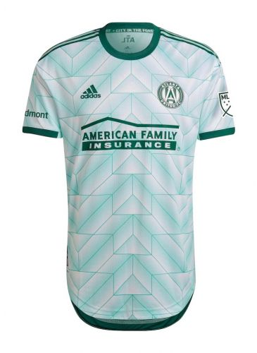
Atlanta joined MLS in 2017 and have primarily used a black/red stripe home look with a white away. I'm a fan of this season's look but they've looked really good throughout their existence.
Austin FC:
Austin is currently playing in their 3rd season so there's not a deep catalogue to pick from. Like Atlanta, they lean on a striped primary (green and black). 2022, their second season, was my choice as the "mint green" secondary is a simple but unique look.
CF Montreal:
Montreal is a Canadian soccer city that has a continuous line of top teir teams going back to 1988. The Supra/Impact/CF Montreal ended up in MLS in 2012. When the team was known as the Impact in MLS they went with the striped look (blue/black) as the primary with white and blue secondaries. Since they've rebranded to CF Montreal they are seem to be alternating between a plack or blue primary (without the stripes). White remains the secondary colour. For me, 2017/2018 is the best this franchise has looked in MLS.
Charlotte FC:
Charlotte is currently playing in their second season. Their Primary has remained the same so that's a no brainer. So it's between a black or purple secondary. I like Purple better. That said, I think Charlotte has one of the most unique and beautiful primary jerseys. They are scheduled to change it next season but I hope that the changes are very minor. The bright and light blue with white sleeves is just beautiful.
Chicago Fire:
Joining MLS in 1998 as the first expansion team the Fire have a very long history of jerseys to choose from. For up until 2019 the Fire had a red primary with a white stripe across the front as the primary. It bugs me that they've moved away from that in recent years. 2013/2013 saw a blue stripe instead of a white one with a unique blue secondary that had a light blue piping. That was my favorite.
Colorado Rapids:
An MLS original. They've changed their primary colour from green to blue to maroon. Since 2007 maroon has been the main primary colour and white has primarily been the secondary. I think the 2019 look was the best. The looks were very simple but sometimes that is best.
Columbus Crew:
Another MLS Original. The Crew has been pretty consistent with a yellow, black or, white kit over the years. 2015 saw a yellow primary and black secondary with a checkerboard pattern. Again, simple but the perfect colour combo for this franchise.
DC United:
MLS Original again! They've consistently used a black primary and white secondary. In a sport where looks change frequently, DC has managed to keep a very consistent look. 1996 to 2007 saw DC use a 3 stripe pattern on the front of the jersey. While that 3 stripe look is gone, likely forever due to jersey sponsorship, I do wish it would come back. 2000/2001 is a good example of this look and that's why it's my choice.
FC Cincinnati:
It's the 5th MLS season for Cincinnati. They're experimented with a few different looks but the primary has been blue every year. Secondary has been either white or orange. To me the orange looks much better. As a result, I think 2022 has been their best look to date.
FC Dallas:
Another MLS original that was originally known as the Dallas Burn for 9 years. In 2005 they change to FC Dallas and introduce white/red hooped jerseys as the primaries which stayed around until 2013. Red has always been this team's primary colour. Blue or green or grey have been secondary colours (usually with white incorporated). I think Dallas looked it's best when it embraced the hoops this I chose 2010's set as my favorite.
Houston Dynamo:
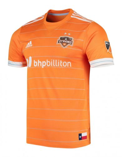
Houston has worn orange as their primary since day one. They used white as the secondary until 2016 when black became the secondary. I do wish this team would use the light blue in their colour scheme more but I think the move to black as a secondary colour was the right move. 2018 saw the Dynamo have 2 very different uniforms but they were both very nice and I thought it was hands-down their best year for uniforms.
Inter Miami:
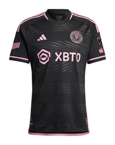
We're in season 4 for David Beckham's team and I think they've finally landed on a good look. Miami should embrace Pink as the primary (though they didn't start that way) so for me this season, 2023, is the best so far.
LA Galaxy:
The Galaxy are an MLS original who have won the most MLS Cups and, basically, invented the "designated player" rule to bring David Beckham to the US which is credited as the "event" that caused MLS to really grow. Prior to Beckham's arrival they were a green and yellow team. When he arrived they updated the logo and became a blue and white team (with yellow as an accent). The Galaxy, throughout their existence, have always gone back to a sash. It comes and goes but to me, that's the look for the Galaxy. For me 2016 was the best look despite it being a time after Beckham had left and they didn't win anything. It's my favorite sash paired with a nice blue secondary.
LAFC:
LAFC joined MLS in 2018 and quickly made LA a city with 2 competitive MLS teams. It's the closest anything MLS has to a true darby style rivalry.
LAFC wears black primarily and white secondarily with gold as an accent on both. To be honest There hasn't been 1 set that I've loved. They've all been "nott good, not bad" but i'll give the nod to 2022 as the design on the primary has a art deco feel too it. Very Hollywood.
Minnesota United:
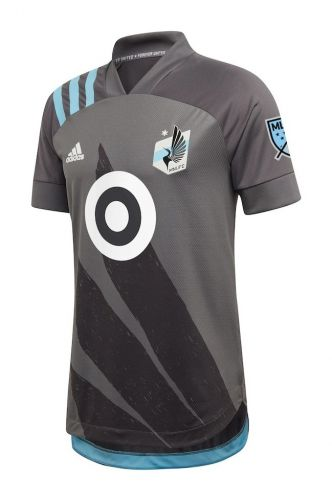
The city of Minnesota has a long history in soccer leading up to MLS but joined MLS in 2017. They've played with grey, light blue, white and, black. In 2021 they had a grey primary including a "wing" (from their logo) sublimated on the front and a plain light blue secondary. In my opinion these are the 2 colours that Minnesota should be using so that season is my favorite look.
Nashville SC:
Nashville entered MLS in 2020 and has kept a yellow primary with a blue secondary for the first 3 years. I think 2022 was the best set to date.
New England Revolution:
MLS original donning the red, white and blue of the USA. Despite that being consistent, they really haven't have 1 uniform element that they keep going back to. They keep trying what's new and fresh but not sticking to anything. Funny enough, they did the opposite with their logo for the longest time.
As a result, my favorite year was one that was very plain looking shirts in 2014.
New York City FC:
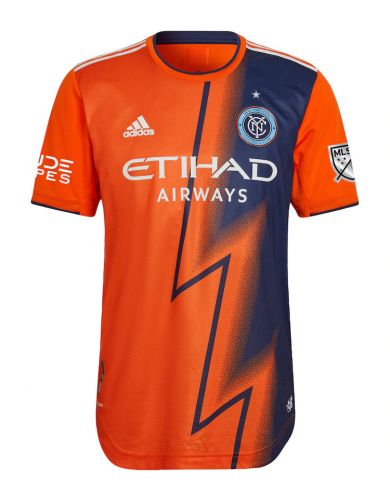
NYCFC is basically baseball's Yankees and the EPL's Manchester City joining up to create an MLS club. As a result I enjoyed when the primary was basically a copy of the Manchester City look in 2022. The secondary that year was a dark blue and orange shirt that looked like a bolt of lightning.
New York Red Bulls:
An MLS original as the New York/New Jersey MetroStars, they were bought by the energy drink company in 2006 and built a stadium in Harrison, New Jersey to open in 2010. Obviously the team looks like an advertisement for Red Bull, as to be expected. The best way they've done so, to me, is in 2015.
Orlando City:
Entering MLS in 2015 wearing a purple primary and white secondary. Orlando has been very consistent. I like when Orlando uses a collar on the purple shirt and gold accents thus the 2017 season was my favorite look.
Philadelphia Union:
2010 saw Philly enter MLS. For 8 years they featured a thick, single stripe down the front which I think they should stick to and as a result I think 2011 was the best look to date.
Portland Timbers:
After years and years of being a successful lower league soccer city Portland entered MLS in 2011. Green is the primary but the secondary has been either white or red.
2019 is my favorite and I can't really explain it other than to say "it just feels right for Portland".
Real Salt Lake:
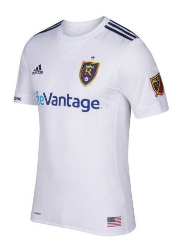
RSL entered MLS in 2005. Right up until this year, RSL wore a red home, white away.
My favorite variations on the red shirts has always been with the blue sleeves so 2018 is the year I chose.
San Jose Earthquakes:
As an MLS original, San Jose played as the Clash for 4 years. They renamed the team the Earthquakes for the 2000 season after the NASL/WSA teams. The team moved to Houston for the 2006 season to be gone for 2 years. A new MLS Earthquakes team came at that time.
They've been a black, blue and, white team since becoming the Earthquakes and once and a while would add red.
2000 to 2002 Nike made the Earthquakes uniforms. Blue with white side panels and a white alternative. I thought these looked very smart.
Seattle Sounders:
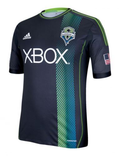
The history behind the name Sounders runs deep through American soccer history but this version entered MLS in 2009. Seattle has worn a green home from day 1 and have played with different away colours over the years. Most of their uniforms have been, in my opinion, really nice. This is probably the hardest team to choose for. That said, in 2013 and 2014 they had a really cool away look so that's what I went with.
Sporting Kansas City:
Originally the Wiz (as an MLS original), then the Wizards and, finally, Sporting Kansas City. This team has had 3 distinct ears of looks under each name but to me, the 1998 season was the best. The look known as the "rainbow uniforms" was so unique.
St. Louis City:
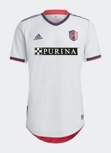
St. Louis City is a brand new team with 2023 being their first season. Not much of a choice to make.
Toronto FC:
TFC entered MLS in 2007 and, for me, it was love at first sight.
Without question 2014 was the best looking year in my opinion. I love when TFC uses onyx as the secondary colour. These 2 uniforms were both unique but still very TFC.
Vancouver Whitecaps:
Much like Seattle, the name Whitecaps has been around since the 70s but the MLS version entered in 2011. The Whitecaps have been very good at keeping their brand consistent with their uniforms but last yea, 2022, was the pinnacle if you ask me. I like when a team looks at the history of the sport in it's city and the NASL (both versions of the NASL in fact) Whitecaps wore shirts with band across the chest.

