The NHL and Adidas released their reverse retro series of jerseys for this year. The idea is that each team takes a uniform from their past and does something a little different to them (different colour scheme or put a different logo on it. Something to that effect) to create a new uniform. I thought I'd throw my thoughts out there about these uniforms and rate them on a scale of 1 to 5 (5 being the best rating, 1 being the worst rating). Just a quick note, I'll be linking back to the uniforms that these are based on and it's very easy to do thanks to The NHL Uniform Database so thanks to them for creating a great resource! Also will lean on the always great sportslogos.net for any logo links.

Anaheim Ducks

Arizona Coyotes

Boston Bruins

Buffalo Sabres

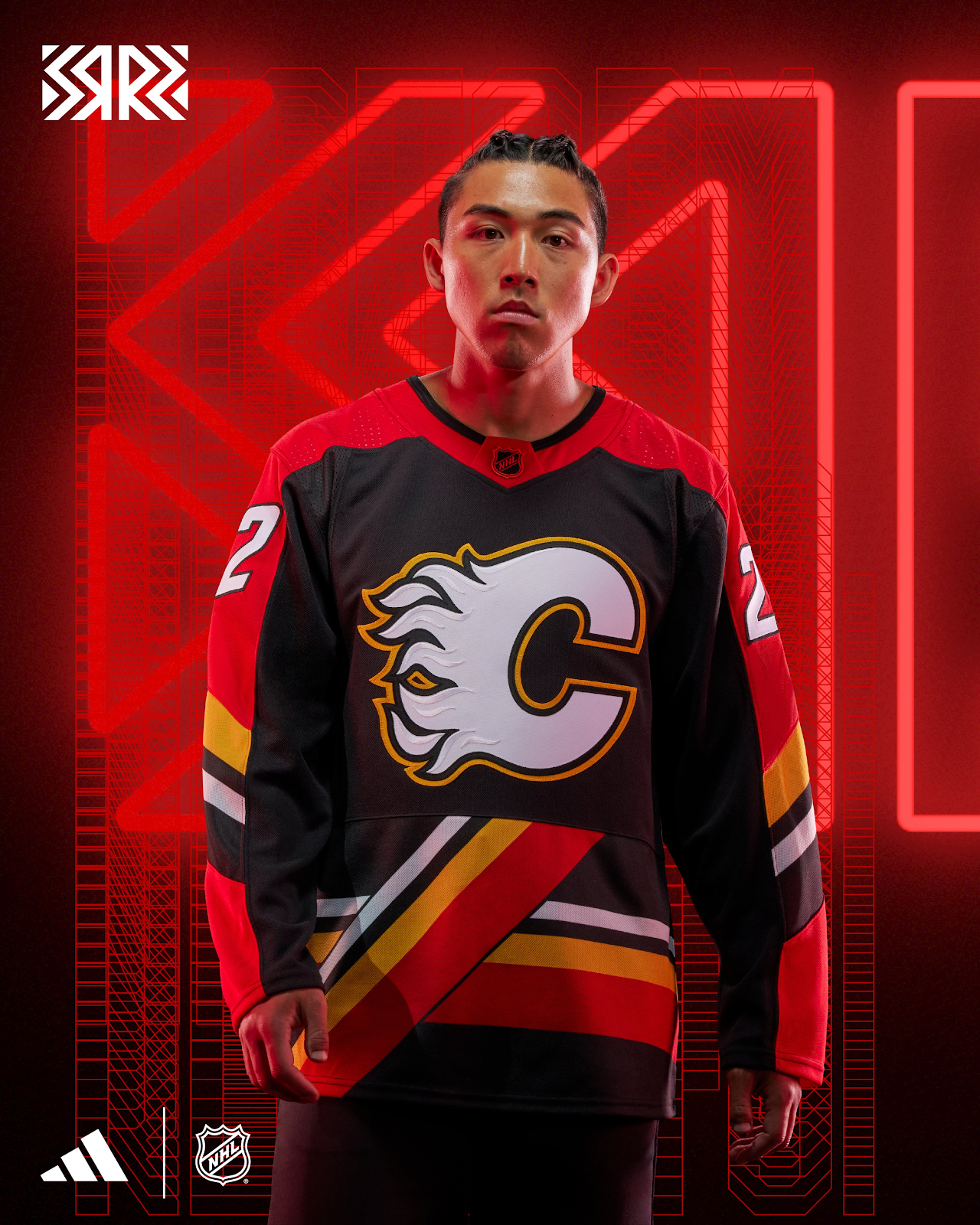
Calgary Flames
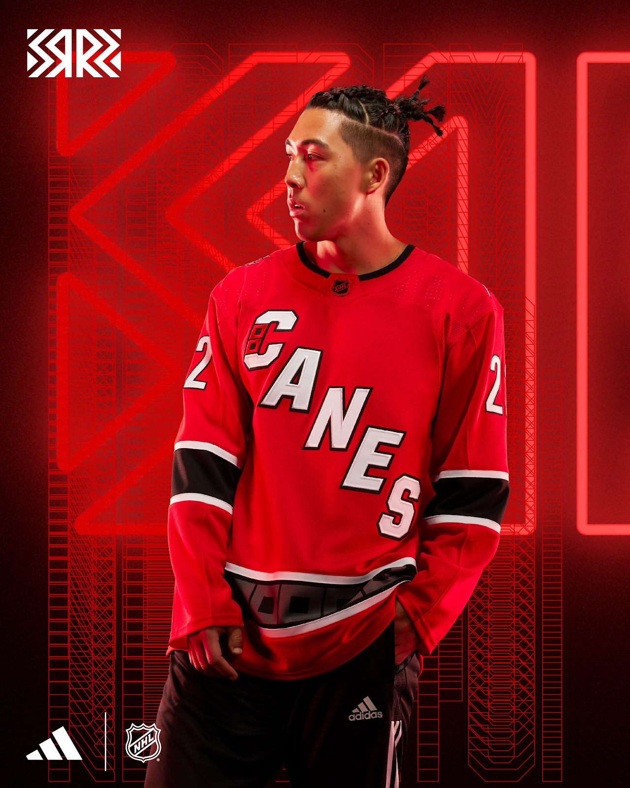
Carolina Hurricanes
Chicago Blackhawks
The Blackhawks have worn their classic red or white uniform for so long that sometimes it's easy to forget that they didn't always wear that. In the 1930s and 1940s they wore a uniform similar to the reverse retro jersey that included the logo on the front. I don't really prefer the wordmark on the front but I get that a logo might make it look too busy. 2 out of 5.

Colorado Avalanche

Columbus Blue Jackets

Dallas Stars

Detroit Red Wings
As an old colleague and friend of mine says I'm a "jersey nerd" (why else would I be doing this post?). Being the "jersey nerd" that I am, I cringe when these types of series happen as Detroit's primary uniforms have mostly remained unchanged since the 1930s and the team has never had a 3rd jersey. So, on the rare occasion they have a "special event" uniform I get worried. I was right to be. The Red Wings were known as the Detroit Cougars in the 1920s and they wore white jerseys with red stripes with the word "Detroit" across the front during the 1927-28 season. This uniform replaces the white with black, a colour this team has NEVER used on their jerseys. 0.5 out of 5.

Edmonton Oilers

Florida Panthers

Los Angeles Kings

Minnesota Wild

Montreal Canadiens

Nashville Predators
In 2001 the 'preds added their first 3rd jersey. This is that jersey recoloured to match the current colours. They're also going to wear gold helmets, pants and, socks with this so get ready to be blinded. Not much more to say about this. 1 out of 5.

New Jersey Devils
As mentioned with the Avalanche; The New Jersey Devils has stops in Kansas City and Denver before coming to New Jersey in 1982. The Devils took the design of their 1982 uniform and recoloured it in the Kansas City/Colorado colours. 2.5 out of 5

New York Islanders
In 1995 the Islanders rebranded with a new logo and uniforms. The look became known as the "fishsticks" look due to the logo looking similar to the logo of the frozen seafood brand, Captain Highliner. This look is a little less "wavy" than the 90's version which I really wish came back. I know it wasn't a popular looks for the Islanders but I really enjoyed it. While I'm happy to see this logo back, this isn't all the way to what I was hoping it would be. 3 out of 5.

New York Rangers
The Rangers have a very iconic look and for most of their history they have worn their blue or white with the diagonal "Rangers" font down the front. In 1996, when Wayne Gretzky arrived, the Rangers added a 3rd jersey that was navy blue and featured a new logo with the head of the Statue of Liberty. The "Lady Liberty" jersey has appeared a few times in the Rangers history now including a white version in 1998 and last year's reverse retro take. This edition brings the original striping back but updates the blue and red (minus one navy stripe on the sleeves) to the primary red and blue. It's a nice update to a secondary look that I really like. 4.5 out of 5


Ottawa Senators
Ottawa took their 1997 3rd jersey as the base for this uniform, coloured it black, added the current logo but, used the 1997 font for the numbers. I feel like Ottawa really got the idea of the reverse retro series but something about it just doesn't do it for me. 2 out of 5. 

Philadelphia Flyers
Philly reached back to their '73/'74 and '74/'75 back to back Stanley Cup Championship days and basically just flipped the orange and black striping on the uniform. To add to the fun, the Flyers are bringing back the Cooperall pants (hockey pants that went down to the ankle) for the warmups when the Flyers wear these uniforms. Much like Ottawa; the assignment was completed but it just isn't doing it for me. I prefer more orange with the Flyers. I'll give them an extra half point for the Cooperalls returning though. 2.5 out of 5.


Pittsburgh Penguins
In the 1990s (and early 2000s) the Penguins were lead by stars Jaromir Jagr and Mario Lemieux. While these 2 played for the Penguins, their primary look was a white uniform with a more realistic-looking penguin logo and a black uniform with a diagonal script saying "Pittsburgh". The logo (that's earned the nickname "Robo Pen") was a departure from the skating penguin logo that the team has since returned to. For this series, Pittsburgh took the 1990s white jersey and made a black counterpart. Almost a true "what if?" kind of thing. Exactly what this series is about and well executed. 5 out of 5.

San Jose Sharks

As a result of this very complicated history, there is a history tracing back to the 1967 Bay Area NHL team for the Sharks. For this uniform the Sharks basically used the 1974 California Golden Seals jersey just replacing the word "Seals" with "Sharks". No confirmation as to whether the Sharks will wear white skates with this (like the Golden Seals did) or not. I really like these. 4.5 out of 5.
Seattle Kraken
How does a second year club do a retro jersey? Well, they look back at the city's hockey history. The Settle Ironmen played in the PCHL from 1944-1952 and won the 1945 championship (President's Cup). In 1952 the Western Hockey League was formed and Seattle renamed their team the Bombers, then the Americans and then, the Totems winning 3 titles along the way. Due to fear that the WHL and AHL may merge and become a viable contender to the NHL, the NHL expanded in 1967 and eventually the WHL ceased operations when the WHA and NHL had taken many markets and most of the talent.
Seattle is throwing back to the 1945 President Cup Champions with this jersey. Personally, I think the jersey is nice and has that throwback vibe but I wish they would have included the stars that the Ironmen had. 3 out of 5.


St. Louis Blues
St. Louis was one of the 1967 expansion teams that ended the Original 6 (even though the NHL actually had more than 6 teams at one point before that era) era of the NHL. When the team name was announced in 1966 there was a prototype jersey that was shown to the public.

For this uniform the Blues opted to make a yellow version of the prototype that never made it onto the ice. While it's a very bright jersey, I think this is such a cool way to approach this series and I look forward to seeing it on the ice. 3.5 out of 5. 

Tampa Bay Lightning
In 1996 the Tampa Bay Lightning added their first 3rd jersey. It was something very unique to the NHL, featuring sublimated designs that depicted lightning on the shoulders and rain and waves on the front. A very busy look that did not include traditional hockey jersey elements like sleeve or waist stripes. For better or for worse, they brought it back with a white base instead of a blue base. I actually do like the white version better and I'm so happy to see the original logo back but this jersey is still just a bit too much for me. 

Toronto Maple Leafs
Time for the home town club. Toronto has a long and traditional uniform history to choose from and the Leafs are going back to 1962 for this series. This uniform is basically the white 1962 uniform with the colours swapped. Not too much to say here, a traditional look that's well executed. 4 out of 5

Vancouver Canucks
Before the Canucks were an NHL team they were a WHL team (the same WHL the Seattle Ironmen played in). In 1966 they applied to become one the 6 NHL expansion teams from the first expansion from the original 6 era. The application was denied. The Oakland Seals (remember them from the Sharks post?) almost moved to Vancouver after a year in Oakland and the NHL vetoed that move as they didn't want an expansion team moving so quickly. To avoid a lawsuit a deal was struck with Vancouver and Tom Scallen (an entrepreneur from Minnesota) was awarded an expansion team and bought the WHL Canucks. The WHL Canucks acquired a number of players with NHL experience to play in their last WHL season. 6 of those players ended up on the first NHL Canucks roster.

The WHL Canucks have been featured in the current Canucks' looks for some time as in 2007 there was a alternate logo featuring the head of "Johnny Canuck" on a V.
A year later the Canucks reintroduced a full-body Johnny Canuck logo in the current colours.
For this jersey, the Canucks took the 1962 version of the WHL Canucks' uniforms and recoloured them to the green and blue of the current Canucks. I love the Johnny Canuck logo and feel it would actually be an upgrade from the current logo. I could live without the numbers on the front of this but otherwise this is a really nice jersey. 4.5 out of 5 for me.

Vegas Golden Knights
I was really hoping that the Knights would use the Las Vegas Wranglers as the inspiration for this series. They didn't.
In fact, Vegas decided to (and I quote) "create a jersey whose design imagines what a Golden Knights third jersey might have looked like in 1995". Look, I get it, the team isn't old enough for a retro jersey but use the City's history with hockey at least. If you include roller hockey (which is less of a stretch than just imagining something) Las Vegas has had 8 different teams to draw inspiration from.
What we got here is a diagonal font that was "inspired by vintage hotel signage on the strip". It also glows in the dark. Honestly, I'd poke fun of that too but if there is one team that can do that, it's Vegas because of all the bright neon lights you find on the strip.
Here's the thing, it's not the worst thing ever (it's not great either) but it also isn't retro at all. So I give it a 2.5 out of 5.


In 1995 the Capitals went through a rebrand. They threw away the red, white and, blue stars and sticks for copper, teal/blue and, white and a bald eagle (with stars). You know what? 10 year old Jeremy loved those uniforms! I get it, a team based in Washington, DC should be red, white and, blue. They are named the Capitals after all, this team should come on the ice to the Star Spangled Banner and wave "Old Glory" and everything else that is stereotypically American. Thing is, this unique colour scheme was eye catching and the bald eagle is still a very American symbol. I was pretty excited when the rumour was out there that these were coming back. This version is all black with just the stripe being teal/blue. It's a bit of a let down to be honest but I guess if they just brought back the teal/blue jersey it would be a straight up retro which isn't the idea of the series. 3.5 out of 5 for me here.

Winnipeg Jets
Last one!
Let's get something out there right now: The Jets are the former Thrashers and the Coyotes are the former Jets. It's a bit confusing if you aren't a hockey fan but the current Jets use the old Jets (now Coyotes) uniforms frequently for retro purposes. To someone that follows hockey and saw the Jets leave and then return (sorta) it makes all the sense in the world. To someone who doesn't it's weird that the current team in Winnipeg is using the old uniforms of the team in Arizona as their retro uniforms. At least it's not as confusing as the link between the Sharks and the Seals.
Let's get something out there right now: The Jets are the former Thrashers and the Coyotes are the former Jets. It's a bit confusing if you aren't a hockey fan but the current Jets use the old Jets (now Coyotes) uniforms frequently for retro purposes. To someone that follows hockey and saw the Jets leave and then return (sorta) it makes all the sense in the world. To someone who doesn't it's weird that the current team in Winnipeg is using the old uniforms of the team in Arizona as their retro uniforms. At least it's not as confusing as the link between the Sharks and the Seals.
For this jersey The Jets are using the 1990 Winnipeg Jets' uniforms. They're removed the red and added the baby blue the current Jets use. The double blue just doesn't work for me. The old Jets red and blue were so nice. 2 out of 5 for me on this one.

Well, that's it. All 32 reverse retro jerseys.
I don't think it will be another 5 years before I post. I have another post idea in my mind. If you've stumbled upon this thanks for taking a read!