Last night the NHL expanded and the
But, being the jersey nerd that I am, the more exciting news to me was the release of the new home jerseys for the entire league. Adidas took over as the uniform supplier. Reebok is owned by Adidas so this is more of a branding shift really. Either way, we got new jerseys! Woo!
As of this morning, not all the away jerseys have been released and their will not be any 3rd jerseys. I thought I'd write a little post explaining how I feel about the new looks. Before I dive into that I just want to give credit where it is due. The images (which show the new jersey on the left, old on the right) are from Icethetics. It a great site for hockey uniform news, go check it out!
Anaheim Ducks
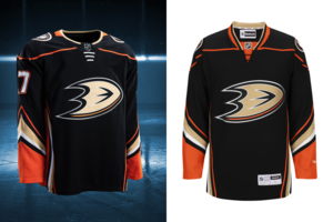
Not a lot of change here. You'll note that the collar is now orange on the back of the jersey and black on the front. A number of teams have opted to go this way and I really don't like that trend. It was something the NFL did and finally we are starting to see them move away from that. On the plus side the white drawstrings on the front look better than the black. Other than that, not much change. Until they bring back the Might Ducks logo, I won't be 100% satisfied with anything they do.
Arizona Coyotes
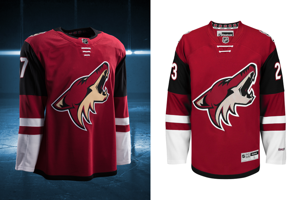
Not a lot of change here either. The new collar design is showing here as well with the black half being black. I really don't like that. Honestly, I don't care much for these uniforms but I really haven't cared much for anything this team has done since moving to Phoenix.
Boston Bruins
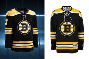
Boston kept it the same for the most part. They did change the font style slightly but it really was so small of a change that most people won't even notice it. A great look that stays!
Buffalo Sabres
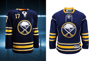
This was one I was really looking forward to. The picture on the right (the old version) is missing the numbers on the front of the uniform. I was hoping that they would remove that, they did not. The collar effect is on the new uniform with yellow on the back, which I don't like. The silver piping on the front is now gone so that is a step up. The tie-up laces have been changed to the non-tie laces. All in all, it feels like 1 step forward, 1 step back with these new uniforms.
Calgary Flames

Another team that moved from tie-up to non-tie laces.
Not a heck of a lot of change with these either but the piping that ran up the jersey onto the sleeves are gone so, it's a step forward. Much like Buffalo there is a step back though, with the collar being black on the back, red on the front. Ant the flag patches are still there, I don't like those.
Carolina Hurricanes
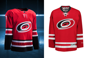
A fun side fact, this team is entering their 20th season since moving from Hartford. That means the Hurricanes have been a thing longer than the Whalers ever were. That's so weird to me. Guess what they did? The collar effect I dislike. Black back, red front.That said; the Hurricanes added black back into their striping which was looks so much better. Although it is faint, the hurricane flag striping pattern is back the in red hem stripe. All in all they are back to looking like Carolina as opposed to team Canada.
Chicago Blackhawks

No changes. Still looking good! One side note, look at their collar, that's how it should be done!
Colorado Avalanche

My team! They brought back the look from those cup winning days. While i'm not thrilled by the collar (grey back, blue front) I'm so glad they brought back the hem striping to resemble a mountain is back so I'm super happy! I'll have to buy one of these.
Columbus Blue Jackets
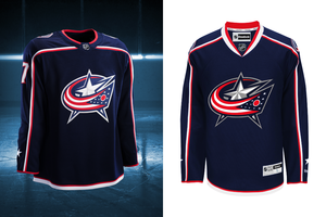
I love this look and I'm glad that they kept it. If I was nit-picking, I would say that the collar should be white and red instead of blue and red but I can live with it as-is.
Dallas Stars
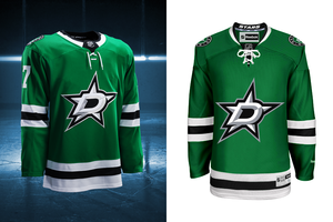
No Change. Again, a great looking uniform that I'm glad went untouched.
Detroit Red Wings

No change. Classic Red Wings.
Edmonton Oilers
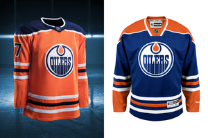
Edmonton made a major change. They "promoted" their orange 3rd jersey, with some changes, to be their new home look. They also changed the blue from royal to navy. The sleeve numbers on the old 3rd were on the top of the shoulders and now are on the sleeves, which I prefer. I like the new orange jersey which is intended to be a throwback to the Alberta Oilers days when this team was in the WHL.
Florida Panthers
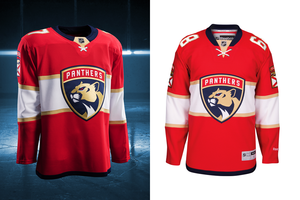
Seeing as this was a brand new look for the team last year, I didn't expect any changes. I still don't like it (maybe it would be a good 3rd jersey) but I want the leaping panther back.
Los Angeles Kings
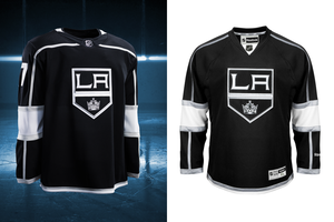
To me, prior to this look, the Kings have had a number of different looks and I liked them all. This look has always been my least favorite and it will probably be the one that sticks because they won a cup in it. That said, there wasn't much change. Just the collar (surprise!) with white on the back and black on the front. So they made their worst look even worse.
Minnesota Wild
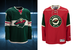
The Wild decided to create a whole new uniform for their home games. Going back to green was a good call! I actually really like what they did, the chest stripe is a cool look and it works well because the outline of the logo is the same colour. They added a little extra "flair" to the sleeve stripes by adding a red stripe into that. It's a big upgrade for me.
Montreal Canadians
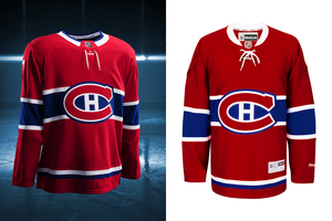
No change, classic Canadians look. As it should be.
Nashville Preditors
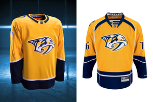
I've never really liked Nashville's yellow jerseys. They have a darker yellow 3rd with a different logo back when Peter Forsberg played there and I wasn't a huge fan of that look either. That said, this change is a step in the right direction in my books. The removal of the white piping and the weird blue on the top of the front of the jersey is a positive. I've heard people complain that the new look is "too plain" but I think plain is better that all the weird design elements that were on the previous version.
New Jersey Devils
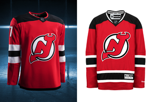
The Devils have basically had the same look since day 1. For a while they featured green in their look but even when they switched from green to black, the look was the same.
Until now.
The sleeve stripe colours were reversed. To me that looks bad but the killer is the hem stripe. It's just a thin black stripe. It looks so bad. Honestly, this looks like when you go to Wal-Mart and you see the jerseys for sale that aren't replicas. They are just kind of similar to the actually jersey but are only like $30 so people buy them because they don't want to spend the money on the actual thing.
Big big downgrade.
New York Islanders

They just can't make anything easy can they? They can't seem to find a home arena, they had some horrible uniforms and now that they are finally back on track (uniform-wise), they go and add that stupid collar. It's a really small change but it really hurts the look.
New York Rangers
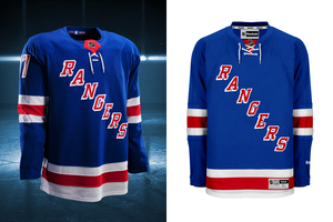
No change. There's a rumor that grey has been added to the white jersey, we will have to see, but if not then the Rangers have kept a classic look.
Ottawa Senators
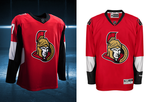
Not much of a change. More black on the sleeves. Too bad, this was one look I was really hoping would change.
Philadelphia Flyers

No change here either. I like this look. Glad to see that they didn't change.
Pittsburgh Penguins

This is my current favorite jersey. Although they went and screwed it up with the collar effect I still love this look. The skating penguin logo is so cool and the colour combo is the best!
San Jose Sharks
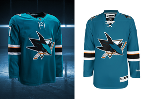
Guess who else did the collar effect that I dislike? Otherwise it's the same. It's really too bad though because this is a team that "got it on 1" and has screwed around with it's look but has never looked as good.
St. Louis Blues
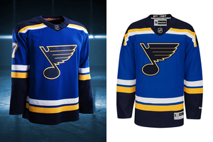
2 very, very small changes for the Blues. 1- the numbers are primarily white now. Historically they've been yellow. 2- the "hanger effect". they changed it from "est 1967" to a design that looks like the city's flag.
I'm not sure how I feel about the white numbers but overall it's still a really good looking jersey.
Tampa Bay Lightening
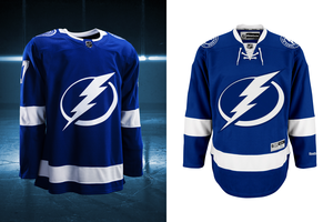
Collar effect here too (why couldn't the whole collar be white?). They also got rid of the tie-up which I actually like.
They still look too much like the Leafs to me, but at least they are staying consistent.
Toronto Maple Leafs
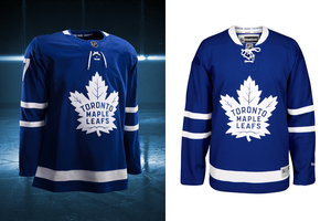
See: Tampa.
But seriously. the whole collar should be white. Toronto just introduced these last year so I expected no change. I still prefer the previous uniform to this one but I do prefer this logo.
Vancouver Canucks
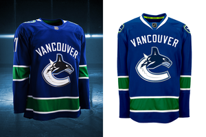
Again, the whole collar should be white. Otherwise no change to a uniform that I like. I think I'd like it better without the wordmark.
Washington Capitals
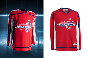
Very small change. The blue piping went to the top of the shoulders on the old one, now it goes across the top of the chest into the bottom part of the collar. Speaking of the collar, it's got red of the front, blue on the back. I don't like that (in case I haven't made that clear)! I was hoping the caps would make a significant change, guess not.
Winnipeg Jets
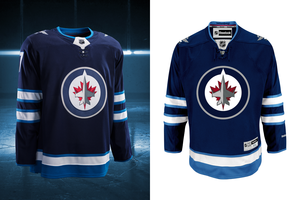
No change. That's cool. I still don't love these but they are sticking with it.
.....And team #31 unveiled their new look as well.
Vegas Golden Knights
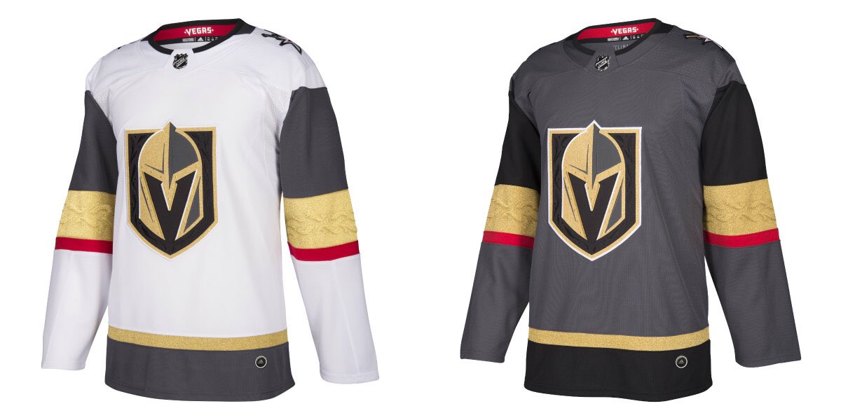
All in all, I actually really like the look. The pattern in the gold sleeve stripes is very noticeable when the light bounces off of it. They are pairing it with black pants and, a grey helmet and socks that match the sleeve striping.
I like the unique grey colour a lot, brings something new to the fold.