I told you it wouldn't be 5 years this time.
In July of 2017 I posted my all time favorite CFL uniforms. I'd like to go down that road again today with the NHL. Thanks again to the NHL Uniform Database for the help with this. Great resource.
As we saw with the NHL reverse retro program, there are some blurred lines as to where they draw inspiration from. For example the Winnipeg Jets (current) using the old Winnipeg Jets (now Arizona Coyotes)
Anaheim Ducks
The Ducks, known as the Mighty Ducks at the time, had a unique colour scheme in the 90s and 2000s. The 3rd jersey was added for the 1995-96 season and it was very different but very fun, something I think 3rd jerseys should be. For the ducks, this is my ideal look.
Arizona Coyotes
When the Winnipeg Jets moved to Phoenix in 1996 they rebranded to the Coyotes. They leaned heavy on desert imagery with a the aztec style uniform and logo. Made sense to me and introduced dark green and clay colours. A unique colour combo for the NHL. While I think the original Winnipeg Jets had great uniforms right before they moved to Arizona, this unique colour scheme trumps it for me. The Coyotes have returned to this look recently and I think that it's fair to say, there's good reason for it.
Boston Bruins
The Bruins have been around since 1924 and have had 30ish different looks over the years. None are too much of a departure from the previous look but the look has evolved over the years. While they are known for white, black and, yellow; I personally prefer the brown, yellow and white years. I'm also a fan of the Bruins using a bear in their logo. 1931-32 was the height of those years for me.
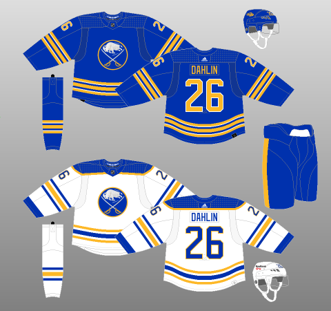
Buffalo Sabres
The Sabres have experimented with black, red and, white in the middle of stints with blue and yellow. They've had some really interesting logos and 3rd jerseys but, much like Arizona and Calgary, sometimes you just get it right off the bat and come back to what worked. In 2021-22 the Sabres did that and man, it looks beautiful.
Calgary Flames
The Flames are the first of 2 teams that moved away from Atlanta. Over the years Calgary has added more black to the uniforms and experimented with different alternate uniforms but, to me, the classic red and orange is the way to go. Much like the Coyotes the classic look has returned recently (2021-22 season) and to me it looks even better on the modern uniform template.
Carolina Hurricanes
The Hartford Whalers moved to Carolina in 1997. While I really liked the 2000-2007 Hurricanes look and the classic green and white of the Hartford Whalers to me, the 1992-1997 Whalers had a great look. The Whalers logo is one of the all time best logos in sports and the white jersey from that time frame is, possibly, my all time favorite NHL jersey.
Chicago Blackhawks
The Blackhawks have been around since 1926 but since 1955 their uniforms have mostly remained unchanged out side of adding a 3rd jersey or a small tweak. So it's not exactly a surprise that the classic look is my favorite.
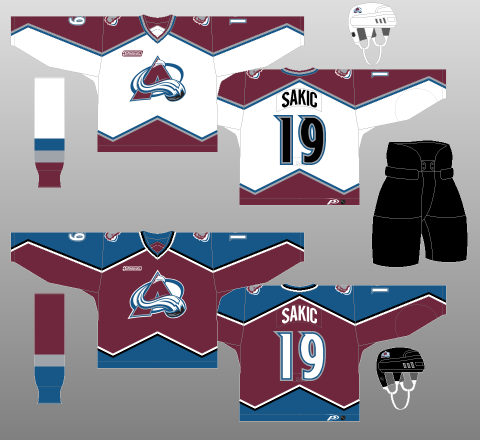
Colorado Avalanche
The Avalanche relocated to Denver from Quebec City in 1995 and almost instantly became (and remain) my favorite team. The Nordiques had some very cool looks but the 1999 look (the Avs darkened the burgundy) was, to me, the best the Avs ever looked.
Columbus Blue Jackets
Columbus is a team that has always been so close but not perfect. The current logo is beautiful and should have been applied to the original uniforms. For me the original uniforms, despite the crappy original logo being on them, were their best look.
Dallas Stars
Another team that currently doesn't play in it's original city. The Minnesota North Stars and Dallas Stars have had a few different looks over the year. Starting as a green and yellow team, adding black to the colour scheme and, eventually when they moved to Dallas, becoming black and green. In 2013 they lightened up the green and adopted silver as the secondary colour. There's a lot of changes and nice looks in their history but I think the current primary uniforms are the best that they have had. I love the silver logo and the colour of green they currently use.
Detroit Red Wings
The Cougars/Falcons/Red Wings franchise has always worn a white and red uniform. Since 1932 the look really hasn't changed much and that's how it should be. Detroit has a great look and it should stay that way until the end of time.
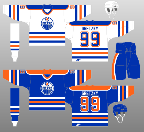
Edmonton Oilers
Edmonton has a weird uniform history in the sense that the uniform has changed a lot but it's mostly been different shades of blue or orange/copper. That said, it's near impossible to deny the dynasty years when Gretzky and crew were dominating the NHL and doing it while looking great.
Florida Panthers
The Panthers have 2 distinct eras in terms of their look. The expansion club that entered the NHL in 1993 kept the "leaping panther" look, for the most part, until 2016 when the club adopted a more life like panther in a crest. To me, this is another team that "got it in 1.".
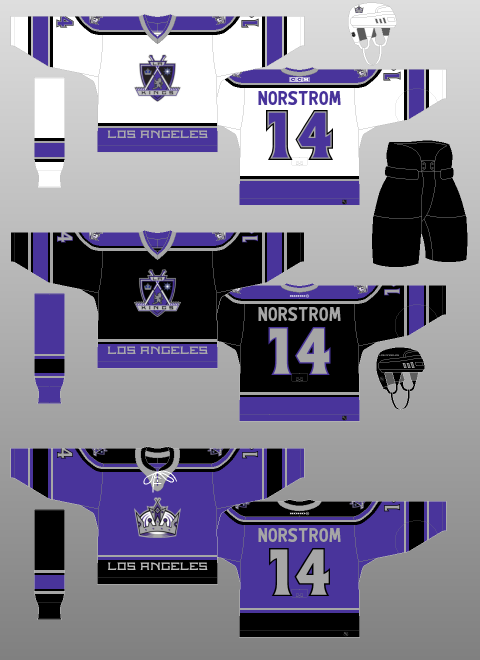
LA Kings
There's 4 eras or LA Kings looks. The 1967 expansion look using the Lakers' colours, the Gretzky era of 1988-1998 black/silver/white look, the purple/silver/black look from 1998 to 2013 when they permanently returned to black/silver/white with a new logo. My personal favorite is probably the least associated with the team historically. 1999-2002 was black/purple/silver and featured a crest logo I really liked.
Minnesota Wild
Minnesota joined the league in 2000 and over their 22 seasons they tweaked the look by adding a 3rd, making it a primary, dropping a jersey, adding another 3rd....ect. So it's never been sweeping changes. That said, the current set were first used in 2017 after 6 different uniform sets over 17 years. I like this look and think they should stick to it now. It took them some time to get here but they have a look that represents a team that is from an area where hockey is traditionally played but the logo is very modern.
Montreal Canadiens
The Habs have been around longer than the NHL in 1910 the club was founded and played their first 7 years in the NHA before the NHL was founded. For the most part, they have worn the traditional red jersey with the blue stripe across the chest. The white jersey has changed a bit over the years but for the most part, it has been intact since 1947. So in terms of choosing a favorite uniform set, there's not much differentiation to choose between. It's a classic look that hasn't and should never change.
Nashville Predators
To be perfectly honest with you; I've never really loved any of the looks that the Preds have worn. If I have to pick my favorite I'd select the original set because they had a shiny silver fabric used on the shoulders which was unique.
New Jersey Devils
The Devils have a number of looks to choose from as they started in Kansas City as the Scouts, moved to Denver to become the Rockies and, finally ended in 1982. I had a hard time with this one because I like the Scout's uniforms, Really liked the Rockies logo and, the Devils have 2 looks I like. The original Devils look with green and red was a nice but from 1992 to 2017 the Devils wore a black and red uniform in an era where they were consistently competitive. In 2017 they moved away from that look and I've never understood why. It's time to bring back the '92-'17 look New Jersey!
New York Islanders
From their inception in 1972 until 1995 the Islanders where known for orange, blue and, white. Then they went off to a completely different look from '95-'98 to come back to the original look just in a darker blue in '98. Introduced a completely different uniform look in 2007 only to revert full time back to the original look in 2010. To be honest, I've like all the Islanders looks. Yes, even the famous "fishsticks" logo (see my Reverse Retro post for more on that) that was introduced in 1995. I'm going to say that the "fishsticks" look is my favorite. I know that's not a popular opinion especially for a team that has a look that is considered to be iconic (and it is!) but man, I just love that "wave" striping pattern and the lighthouse shoulder logo. I admit, the look would be very dated if it was still being worn today as a full time look but, damnit, I love that uniform even if it's not a popular take. I'm sorry.
New York Rangers
Since 1926 (except for 2 years in the 70s) the Rangers have worn their iconic red, white and, blue with the diagonal "RANGERS" script on the uniform with very minor changes. In 1996 they introduced the "Lady Liberty" Jersey (again, see more on the Reverse Retro post) and everything was perfect in Rangers land as far as I'm concerned.
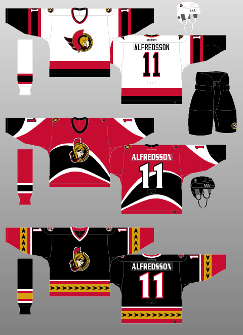
Ottawa SenatorsThe Ottawa Senators like to kind of blur the lines and make it seem like they are a continuation of the club that existed from 1893 to 1934 and won 11 Stanley Cups in 6 different leagues. They clearly are not. They are a 1992 expansion club. The Sens have played around with their look over the years (not drastically but distinctly enough) but to me they were at their best in from 2000 to 2007. 3 unique jerseys; the traditional white uniform with the original logo, a modern red and unique red uniform and, a black 3rd jersey that was a mix of traditional striping patterns with a modern way to execute those stripes.
Philadelphia Flyers
For the most part the Flyers have kept their look consistent. Orange or White (or black) jersey with a contrasting shoulder colour. There's been a number of variations on that look but I appreciate the the Flyers have picked a look and stuck to the same basic concept over the years. That said, when I picture the Flyers I picture their mid 80s to late 90s look. If I was having a discussion on this topic and someone picked a different era, it'd be hard to argue to be honest but this is the look I think of when I think Flyers hockey.
Pittsburgh Penguins
The Penguins are a funny team in the sense that I think most people think the uniform that they are currently wearing is what they wore through most of their history but that's not the case. They started as a blue blue team in fact. It wasn't until 1980 when they adopted the yellow, black and white that the other Pitt teams wear. Over the years the Penguin logo has changed, they adopted a Rangers style font across the front of the jersey and, they changed from the traditional yellow to a shiny colour known as "Vegas Gold" (just to change back). In 2016 the Penguins dropped Vegas Gold and brought back a very traditional Penguins look. I think, after decades of experimenting, the Penguins have landed on what should be their permanent primary look. Play around with the 3rd jersey but don't change the primary uniforms anymore please!
St. Louis Blues
The Blues are another team that has tweaked a lot over the years but hasn't made to extreme of a change besides for adding red as a primary colour in 1995-1998. While I liked that uniform quite a bit (another unpopular opinion) the Blues look best as a lighter blue so I'm pointing to the mid 70s to mid 80s era for their best look.
San Jose Sharks
Ok, so there's a whole weird history with the Sharks and how they could be considered the continuation of the California Seals and Cleveland Barons franchise. I won't retype that all out (again, my Reverse Retro post has the scoop on all that) so for this exercise I'm only going to look at the uniforms the San Jose Sharks have worn. This is another case where the original look is best in my opinion. They've messes around with an "arch" pattern, they added more orange to the look, they took away striping and now, they are going full in on teal (teal pants and helmet) but to me it's time to just go back to the original uniform. Put the newer logo on it if you want but just go back.
Seattle Kracken
This one is a no-brainer. They're entering year 2 in the NHL and have only had 1 uniform. That said, I'm a really big fan of the uniform and have one in my collection. This is one of those cases where I hope no one touches it down the line and ruins a good thing.
Tampa Bay Lightning

Tampa Bay came onto the scene with a look that was unique (primarily black with silver and blue) and a bit gimmicky. Over the years they have had the most busy looking 3rd jersey (which they have thrown back to for the current Reverse Retro jersey), they over simplified their logo and uniform and now are a blue and white team with a very simple logo. The common criticism is that they took the Leafs and Red Wings uniforms and "mashed them up" to get their current look. It was never more apparent to me than in the first round of the playoff last year; Tampa played Toronto and it really looked like an inter-squad exhibition match up. Tampa needs to revert back to including black in a big way if you ask me. I think the current logo is actually a really nice logo but they need to get their identity back. So, I'm hoping that one day soon they come out with a new look that I will consider the all time best but until that comes I select the 2001-07 look. Prior to this look they messed around with different fonts on the back of the jersey, most of which were horrible. Once they went to a normal, readable, font they were in much better shape. Tampa also needs to bring back the "victory stripes" in the armpit. Is it silly? Yes, stripes that can only be seen when "the players lift the Stanley Cup" but it was unique to Tampa and I think it should be brought back.

Since 1917 Toronto has been home to the Arenas/St. Pats/Maple Leafs. From 1919 to 1927 They were the St. Pats and wore green, otherwise they have been a blue and white team. The Leaf on the uniform has evolved over the years, the striping on the uniform has too. For a brief period of time they added a silver accent but through it all it's been pretty simple: Blue leaf on white jersey or white leaf on blue jersey. All very traditional striping patterns. In 1967......just in time for the last Stanley Cup run......the Leafs updated their logo to match the leaf on the Canadian flag. It's always been my favorite of the logos. For some reason all the lettering in the logo is capitalized except the "n" in the word Toronto and I have no clue as to why. It's quirky and weird and I love it.
Vancouver Canucks
Here's a team that's had an identity crisis. From the green and blue "stick in the rink" logo days to the black.red/yellow "V" days, so the "spaghetti skate", to the Orca in red/blue/silver finally to the orca in blue and green today; this team has not been afraid to change their look completely. While I think the general consensus is that my pick is probably one of the least favorite picks of all, I found the original Orca look to be very nice. The colour combo was unique, the logo was (and remains) the best primary logo they have (not the best logo period though) and it was just something a little different.
Vegas Golden Knights
Another young team so there's not much to choose from. They added a gold jersey in 2021 as a 3rd jersey. It's now it's become the primary uniform. I don't like the gold jersey. I get it, they are the Golden Knights but it's just too much. So let's go with the original set.
Washington Capitals
I touched on it a bit in my reverse retro post but man, I loved the 1995 Capitals rebrand. The original jerseys with stars on them are great. Since returning to the red/white/blue they've had some great 3rd jerseys. To me though, the teal and copper from 1995 was great.
Winnipeg Jets
In 2011 the Atlanta Thrashers moved to Winnipeg to revive the Jets name. Hockey returning to Winnipeg was fantastic and I really like the new Jets logo. That said, I've never like the new Jets jerseys. I feel they missed out when deciding to go double blue instead of blue and red. They've had some great Heritage Classic uniforms because they've used the old Jets colours but those don't count for this exercise.
While hockey just doesn't seem to work in Atlanta, I did like the Thrasher's branding a lot. The primary logo was cool and the waist striping, much like the 2000 era Sens was a traditional striping pattern but with a modern spin to them. The 1993-2003 Thrashers were very cool.
Ok, that's that. all 32 NHL teams. My all time fave uniforms (as of today, Nov 3, 2022). I've been enjoying this series so maybe I'll continue on with another sport soon.