So, I listen to the Toronto Mike'd podcast pretty religiously.
I think I've missed 1 or two episodes ever. It's a great podcast and it's so cool that this guy is just sitting in his basement and he gets some really big names in Toronto media to come down and have a chat. If you haven't listened, I suggest that you do. Find your favorite Toronto media figure and check out his episode with them. For me, it started at episode 69 with Jason Agnew, one of my all time faves and it just grew from there.
Lately he's been getting some guests to return and they play their top 10 favorite songs and kind of chat about why these songs are on the top 10 for them.
While I have found that there are some "kick out the jams" episodes that have songs I don't enjoy, it's still be really cool to hear why people like them thus keeping me engaged. I think it's also a great way for Mike to get people back in the basement and usually we get a little update on how they are doing/how their career is going at the start. To date, my favorite KOTJ episode was Bob Willette's epsiode, some really good music in that one!
Seeing as I don't work in that industry, I'm not waiting for a call from Mike to be in one of these episodes :)
Instead I thought I'd write a blog about my top 10 inspired by these Toronto Mike "kick out the jams" episodes.
Dammit by Blink 182
I don't recall when I first heard this song but I know that I liked it right away and there hasn't been a time when this song has come on since where I've skipped the song. This may be one of the only songs I've always passionately loved. It's fun, it's catchy, it's easy to sing along with and, the message is one we can all relate to.
The Tide by The Spill Canvas
This song is so soft and calming in terms of the sound but the message is so sad. It's a really weird combination of a calm sound with a not-so-calm story being told. There are some lines in this song that really resonate with me as well. I find a weird comfort listening to this song when I'm feeling sad and it has been my "go-to" for that reason.
Dilemma by Nelly and Kelly Rowland
I was never a big fan of any other genres of music other than hard rock and punk until friends that I worked with introduced me to this song when it came out. It's so catchy and the story is actually a weirdly sad story. I'll never forget the day I was driving up to work and blasting this song and my co worker (who was outside having a smoke) jumped up and started cheering the fact that I went ahead and got the CD and was blaring this song in my car. Such a great memory from a time where I was meeting a whole new group of people at that job who opened me up to a much different world and, as part of that, all sorts of new music.
Chop Suey! by System of a Down
The obvious theme here is that these songs bring back memories. For me, the memory surrounding this song is negative. When I look back at that time, I realize I was feeling teenage angst because this was a time where everyone was figuring out what they wanted to do with their life and I really didn't know what I wanted to do. I just wanted to figure things out but at the same time all I wanted was to be self-sufficient because, through having a lot of friends who were about 5 years older than me via my job, I felt like I was just behind them all the time. This song is calm and builds and then "boom" the angry screaming happens. That was a lot of how I felt in those times. I always found the line "trust in my self righteous suicide" such a powerful line as well. I guess all people who commit (or think of committing/try to commit) suicide feel that they are self righteous but for some reason that line was just so powerful to me. So I guess in some manner it's got a weirdly deep angle to it too.
Wagon Wheel by Darius Rucker
It's catchy and it's fun. Plus, this is the song my friends and I all sing around the campfire when we go up to the cottage. This song just makes me smile.
The Best Deceptions by Dashboard Confessional
Everyone has a sad break-up song, right? This is mine. I guess it's kind of weird that a song that I associate with being so sad is one of my all time favorite songs but this song just has so much feeling so even when I'm not listening to it because of a break up, I love listening to it. I really love the line "So kiss me hard because this will be the last time that I let you".
A bonus is listening to the MTV live unplugged version (which is why I chose to use that video instead of a music video) and hearing the crowd sing along word for word.
Bloody Kiss by Latefallen
For a period of time in my life, going downtown to concerts was what I did. There were plenty of nights spent at the Bovine Sex Club (which, despite it's name is a concert venue/bar) on Queen street. One of the mainstays? Latefallen, a great Toronto band who I became pretty obsessed with and became pretty good friends with the drummer, Bob. To this day, I still don't understand how they didn't get signed. Anyways, beyond the nights in Toronto, I spent a number of nights in London going to see Latefallen with friends who went to university out that way. Lots of fun nights at that period of time. This song/video ended up getting a little play on Much Music as well, which was really cool.
Grand Theft Autumn/Where is Your Boy by Fallout Boy
Fallout Boy's album "Take This to Your Grave" might be my all time favorite record. Top 3 for sure. This song is my favorite of the album and, one of my all time favorite Fallout Boy songs too. Just in case it wasn't obvious, they are one of my all time favorite bands too. I mean, what else can I say? Great song, great album, great band.
I Fought the LAW by Green Day
Green Day is another one of my all time favorite bands. They've been at it so long and they just keep putting out great music. Originally, I was going to use American Idiot as the song I chose because it's the title track to my favorite Green Day album but, after thinking about it a bit more, I realize that this cover means a little more to me and it's all that more applicable after news that broke this week. This cover has been used by Live Audio Wrestling, a weekly Wrestling/MMA radio show that I have been a fan of for about 15 years which has spun off about 6 or 7 podcasts during the week as well. Until this week that his, all the hosts were let go and the LAW is being retooled. These hosts, for the better part of 15 years, have been growing their careers and I have been a fan an following along. So, between one of my favorite bands and one of my favorite radio shows, we have a song here with that's become pretty sentimental.
Not by Your Side by GG Cole and Lakeview
Last song. GG Cole and Lakeview, a band that includes 2 of my friends. Going to their shows and seeing friends has always been a lot of fun but there's more meaning. This band also links me to a group of friends who go to wrestling events together and brings back memories of my days trying (not very well) to make it as a professional wrestler. It's really just a big circle of memories through some long-standing friends and listening to their music brings that all back for me.
Those are my jams!
So, to end it just like Mike does.....here's some lowest of the low to play you out :)
Wednesday, November 1, 2017
Tuesday, July 25, 2017
All Time best CFL uniforms.
If you haven't guessed by now, I love sports uniforms.


When I found Chris Creamer's Sportslogos.net website about 10 years ago, my interest was heightened to a new level.
I have spent a fair amount of time speaking about the Toronto Argos uniform changes this year over on the boards at Sportslogos.net. Which has lead to me this post: My personal favorite look for each of the CFL teams.
Originally, I was going to go through all the teams but some haven't really had more than 1 look like the American expansion teams or, in the case of the Ottawa Renegades, only 2 looks.
So, I will be posting my favorite looks for the current CFL teams. I realize that doesn't leave much to chose from for the Ottawa REDBLACKS as they are only in their 4th season.
Let's start in the West division (alphabetically).
BC Lions:
I have always been a fan of the paw print logo of the 60's. From 1963 to 1966 the Lions wore the below uniforms and I loved them. From the simple number font to the orange not being over-used or too bright (as I feel the orange has become over the years). In my mind, this uniform is the best they ever had.
Calgary Stampeders:
Sometimes keeping it simple is the way to go. In the 80s and 90s the Stamps did that. Red helmet, simple jersey with the logo on the sleeve, socks match jersey, opposite colour for the pants. Minimal inclusion of black made this team have a unique look.
Edmonton Eskimos:
In the early 2000s The Eskimos were a great looking team! A lot of people have compared this uniform to the Green Bay Packers. There are key differences (like the Packers don't wear white pants) but I get it. That doesn't mean Edmonton's uniforms were bad. After this set, the Eskimos tried a few very different looks with piping and added a green helmet. None are as nice as this.
Saskatchewan Roughriders:
I had a little harder time with getting a complete uniform history of the 'Riders but the set that the riders wore up until 2002 (I believe it was introduced in the 80s.) was hands-down the best.
Although I could take or leave the black 3rd jersey, the home and away I still love! The helmet with the logo stripes that connected in the back and the grey pants. To me, this should always be the 'Riders look.
Winnipeg Blue Bombers:
From the 70s right through to 1995 the Bombers wore a set unique to all of football. The gold helmets and pants were great and having a blue uniform (I mean, they are the BLUE Bombers) just makes sense. I also really liked that the sleeve stripes matched the sock stripes.
Off to the East now!
Hamilton Tiger-Cats:
In 1967 the Ti-Cats adopted the below uniforms that were the look until 1986, when the switched to a black helmet. The yellow helmet was a unique look and the sleeves being different colours was also unique. It's these little things that make this uniform set so unique and I really wish they would just bring it back.
Montreal Alouettes:
The Alouettes have a weird history, from the 1946 to 1981 they were the Alouettes. From 1982 to 1985 the team was re-names the Concordes just to be re-named the Alouettes in 1986 & 1987 before the team folded. Then, in 1994 & 1995 Baltimore received a CFL expansion team but after the NFL came back to Baltimore (funny enough, it was the Browns who have a similar historical "blip") The Stallions were moved to Montreal as the Alouettes to "resume" the history that ended in 1987. So basically, according to history, the Alouettes took a break from 1988 to 1996. Unlike I did with Ottawa, which has had 3 uniquely different teams, I opted to follow this weird historical allowance.
With that said, the 1970-1973 uniforms were my favorites. The logo was simple but still conveyed a bird and, the red and green colour scheme (even though it may remind you of Christmas) was different and the sleeve stripes are a classic.
Ottawa REDBLACKS:
The REDBLACKS (yes, capitalizing the whole name is correct) have only had 2 uniform sets thus far as I mentioned earlier. I don't particularly love either to be honest but I prefer the first set. The all black look is generally something I do not love but, due to the team name, it makes sense (with the red numbers). I really liked the idea of the 3rd but it never panned out. Drop the logo on the front for numbers and it looks much better. I still hope to see a uniform that has a lot of the plaid look one day.
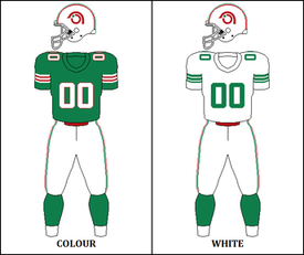
Toronto Argos:
So many looks to choose from but from 1981 to 1988 the Argos wore what I prefer. I love that football as a boat logo (and this was the last time it was used as a primary logo) and I like the kind of "chunky" sleeve stripes. Simple but a little different.
So I guess you could say, if I was in charge, this is what the CFL uniforms would look like in 2017.
If you prefer a different look, let me know in the comments! I always like to hear other people's preferences and why.
Friday, July 7, 2017
Argos at BMO (yup. Again)
It was a week ago today that I decided to go check out the Argos at BMO.
Anyone who has read this blog before knows that I never thought that BMO was the solution for the Argos. That said, I went to the game with an open mind and I really hoped that I was going to be pleasantly surprised. Anyone that knows me knows that I love the CFL (hell, I live within walking distance of Tim Horton's field) and I want this league to do well, so is it really a surprise that I want the Argos to do well?
Well, I have to admit I came out with mixed feelings.
I will say this, I sat in the south end and there was a very small but very passionate group of fans who were right into it and they were very friendly and invited me to hit their drum and wave their flag. That is so cool! I think that more of this is needed for the Argos to succeed.
I do think that the BMO field ground crews have done an amazing job of keeping the grass in good shape and painting the lines so that you only see the lines applicable to the sport being played.
Football belongs outside. It just felt right being outside to watch the Argos.
That said, there are negatives. First off all there were only 11 thousand people there. The place looks so empty. I can't believe I'm going to say this but the Argos should tarp off sections to keep the crowd from looking so sparse. You see it on TV and you feel it in the stadium.
The Argos have also "retired" the Argonotes and replaced them with a drum core group. While the drum core is very talented, I think they have abandoned a large portions of fans who would help make that atmosphere better.
TFC have proved that the location of the stadium is not an issue. So we can't say that is a problem. I was in Liberty Village just north of the stadium (enjoying a beer) just before the game and was able to walk over in about 10 mins, that is not an issue. For those who don't know, liberty is chalk full of bars and restaurants. It's the perfect neighborhood to accompany a stadium.
So what is it? Is the CFL just not relevant in Toronto anymore? I can't think that is the case. The Argos have been here since 1873. Is it because TFC and the Jays have been competitive over the past couple of seasons? Is it because the Wolfpack are turning heads and, there just isn't enough money to be spread around all the pro teams in the city? Maybe people would prefer to stay home and watch the game on TSN?
I really don't know. I heard a theory that the Wolfpack and Argos should go in together on a 15,000 seat pop up stadium. Maybe that would be a solution?
I really don't have an answer for this one but something has got to change, a large company like Bell won't hold onto the team if it is just bleeding money, even if the team is part of a league in which their TV property (TSN) is the official broadcaster. Then what?
Thursday, July 6, 2017
NHL Expansion Thoughts
So the Vegas Golden Knights are officially a thing. They have a roster, they have a uniform, all signs point to "go!".
I was listening to one of my favorite podcasts, Basically a Sports Show, and they were talking about how crazy this expansion is which inspired me to do this post.
In a nutshell, the NHL said "no" to Quebec even though they have a new arena built and a potential owner who makes his money from a telecommunication company (so it would be really easy to get the team a regional TV contract).
The NHL did admit Las Vegas. They also have a new arena and a wealthy owner.
The NHL was also expecting a bid from Seattle but, nothing came.
Seems pretty apparent that the NHL just wanted to let Las Vegas and Seattle in if you ask me which leads me to my point; I feel the NHL only wanted to expand to the west in order to balance their conferences (I know; this isn't a new or groundbreaking thought).
In 2013 the NHL move the Columbus Blue Jackets and the Detroit Red Wings to the eastern conference (for the 2013-14 season). This left the Western Conference with 14 teams and the Eastern Conference with 16. Adding 'Vegas has started to balance out the conference but let's say, for argument's sake, that the NHL let in the only other bid: Quebec City.
Quebec would need to be in the Eastern Conference. That would leave the West with 15 teams and the East with 17 teams. How would that balance out so there are 16 teams each?
There are a few options but we need to keep in mind that Detroit has asked for years and years to be in the East and the likelihood of them accepting a move back to the Western conference is very slim.
In mind mind, there are 2 solutions.
(note, I threw together a very quick visual with a map I found here. Blue = Western Conference, Red = Eastern Conference)
#1 Just move Columbus back to the Western Conference. They've been there before, it seems like a simple solution. I understand that means that they would play Pittsburgh less but, it may make that budding rivalry more special. Could you imagine if those 2 teams met in the Stanley cup Final?
I will admit, that may not be the solution that the league is looking for. So here is a solution that may make some sense geographically. In the West, it is more common to see teams that are not within driving distance of any other team. For example, the Stars and Avalance are so far away from other teams it is safe to say that someone a state over could even be fans of these teams as their "local team". Where as New York State has 3 teams plus the Devils are just across a bridge from new York state.
My thought process would be this: Move the Florida teams to the Western Conference. Yes, I know the Panthers are further East than a number of Eastern Conference teams in that case. Thing is; the Florida teams are kind of out there, all by themselves geographically, and I think that being in either conference doesn't really effect their travel costs in that case. They also would still be in the same conference so they could continue to play each other the same amount of times as they do now.
If we move those 2 teams west then, to balance things out, the Predators should move to the East.
What this alignment does as well is set up the NHL for a future Seattle team. Let's say any of the Eastern teams (except Nashville) in this alignment move to Seattle (I won't chose any 1 team in particular because it really doesn't matter who it is).
In that scenario, the Preds can move back West with the new Seattle team and the Florida teams can move back East.
I realize that this senario has Lightening and Panthers fans staying up late when their teams are playing in California/Vancouver but Detroit fans had to endure that for a very long time. Nashville fans currently endure it to some extent as well. It's just always going to be a fact when it comes to the NHL.
I think that's how I'd do it if I was asked by the NHL to realign the teams.
I was listening to one of my favorite podcasts, Basically a Sports Show, and they were talking about how crazy this expansion is which inspired me to do this post.
In a nutshell, the NHL said "no" to Quebec even though they have a new arena built and a potential owner who makes his money from a telecommunication company (so it would be really easy to get the team a regional TV contract).
The NHL did admit Las Vegas. They also have a new arena and a wealthy owner.
The NHL was also expecting a bid from Seattle but, nothing came.
Seems pretty apparent that the NHL just wanted to let Las Vegas and Seattle in if you ask me which leads me to my point; I feel the NHL only wanted to expand to the west in order to balance their conferences (I know; this isn't a new or groundbreaking thought).
In 2013 the NHL move the Columbus Blue Jackets and the Detroit Red Wings to the eastern conference (for the 2013-14 season). This left the Western Conference with 14 teams and the Eastern Conference with 16. Adding 'Vegas has started to balance out the conference but let's say, for argument's sake, that the NHL let in the only other bid: Quebec City.
Quebec would need to be in the Eastern Conference. That would leave the West with 15 teams and the East with 17 teams. How would that balance out so there are 16 teams each?
There are a few options but we need to keep in mind that Detroit has asked for years and years to be in the East and the likelihood of them accepting a move back to the Western conference is very slim.
In mind mind, there are 2 solutions.
(note, I threw together a very quick visual with a map I found here. Blue = Western Conference, Red = Eastern Conference)
#1 Just move Columbus back to the Western Conference. They've been there before, it seems like a simple solution. I understand that means that they would play Pittsburgh less but, it may make that budding rivalry more special. Could you imagine if those 2 teams met in the Stanley cup Final?
 |
| The Blue Jackets move back West |
I will admit, that may not be the solution that the league is looking for. So here is a solution that may make some sense geographically. In the West, it is more common to see teams that are not within driving distance of any other team. For example, the Stars and Avalance are so far away from other teams it is safe to say that someone a state over could even be fans of these teams as their "local team". Where as New York State has 3 teams plus the Devils are just across a bridge from new York state.
My thought process would be this: Move the Florida teams to the Western Conference. Yes, I know the Panthers are further East than a number of Eastern Conference teams in that case. Thing is; the Florida teams are kind of out there, all by themselves geographically, and I think that being in either conference doesn't really effect their travel costs in that case. They also would still be in the same conference so they could continue to play each other the same amount of times as they do now.
If we move those 2 teams west then, to balance things out, the Predators should move to the East.
 |
| The Florida teams move West |
In that scenario, the Preds can move back West with the new Seattle team and the Florida teams can move back East.
I realize that this senario has Lightening and Panthers fans staying up late when their teams are playing in California/Vancouver but Detroit fans had to endure that for a very long time. Nashville fans currently endure it to some extent as well. It's just always going to be a fact when it comes to the NHL.
I think that's how I'd do it if I was asked by the NHL to realign the teams.
Thursday, June 22, 2017
New NHL Jerseys
Hi Internet. It's been a while.
Last night the NHL expanded and theLas Vegas Golden Knights are now officially a team with a uniform and an initial roster.
But, being the jersey nerd that I am, the more exciting news to me was the release of the new home jerseys for the entire league. Adidas took over as the uniform supplier. Reebok is owned by Adidas so this is more of a branding shift really. Either way, we got new jerseys! Woo!
As of this morning, not all the away jerseys have been released and their will not be any 3rd jerseys. I thought I'd write a little post explaining how I feel about the new looks. Before I dive into that I just want to give credit where it is due. The images (which show the new jersey on the left, old on the right) are from Icethetics. It a great site for hockey uniform news, go check it out!
Anaheim Ducks
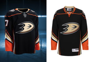
Not a lot of change here. You'll note that the collar is now orange on the back of the jersey and black on the front. A number of teams have opted to go this way and I really don't like that trend. It was something the NFL did and finally we are starting to see them move away from that. On the plus side the white drawstrings on the front look better than the black. Other than that, not much change. Until they bring back the Might Ducks logo, I won't be 100% satisfied with anything they do.
Arizona Coyotes
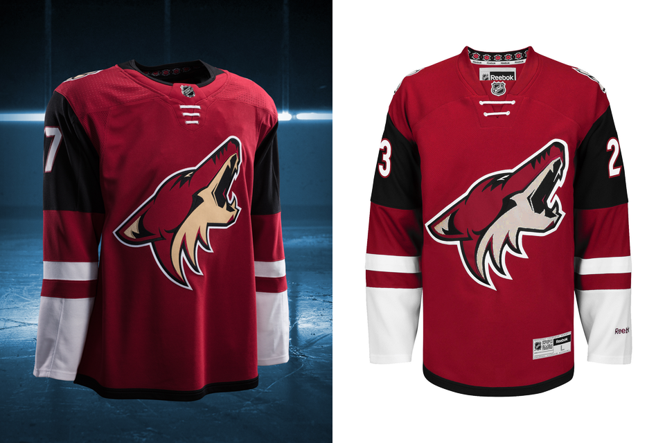
Not a lot of change here either. The new collar design is showing here as well with the black half being black. I really don't like that. Honestly, I don't care much for these uniforms but I really haven't cared much for anything this team has done since moving to Phoenix.
Boston Bruins
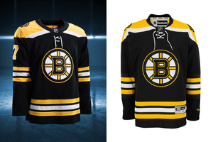
Boston kept it the same for the most part. They did change the font style slightly but it really was so small of a change that most people won't even notice it. A great look that stays!
Buffalo Sabres
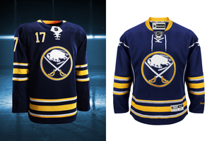
This was one I was really looking forward to. The picture on the right (the old version) is missing the numbers on the front of the uniform. I was hoping that they would remove that, they did not. The collar effect is on the new uniform with yellow on the back, which I don't like. The silver piping on the front is now gone so that is a step up. The tie-up laces have been changed to the non-tie laces. All in all, it feels like 1 step forward, 1 step back with these new uniforms.
Calgary Flames

Another team that moved from tie-up to non-tie laces.
Not a heck of a lot of change with these either but the piping that ran up the jersey onto the sleeves are gone so, it's a step forward. Much like Buffalo there is a step back though, with the collar being black on the back, red on the front. Ant the flag patches are still there, I don't like those.
Carolina Hurricanes
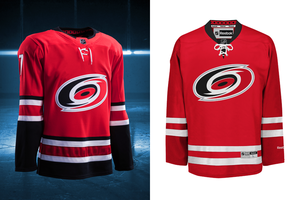
A fun side fact, this team is entering their 20th season since moving from Hartford. That means the Hurricanes have been a thing longer than the Whalers ever were. That's so weird to me. Guess what they did? The collar effect I dislike. Black back, red front.That said; the Hurricanes added black back into their striping which was looks so much better. Although it is faint, the hurricane flag striping pattern is back the in red hem stripe. All in all they are back to looking like Carolina as opposed to team Canada.
Chicago Blackhawks

No changes. Still looking good! One side note, look at their collar, that's how it should be done!
Colorado Avalanche

My team! They brought back the look from those cup winning days. While i'm not thrilled by the collar (grey back, blue front) I'm so glad they brought back the hem striping to resemble a mountain is back so I'm super happy! I'll have to buy one of these.
Columbus Blue Jackets
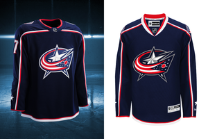
I love this look and I'm glad that they kept it. If I was nit-picking, I would say that the collar should be white and red instead of blue and red but I can live with it as-is.
Dallas Stars
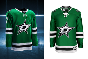
No Change. Again, a great looking uniform that I'm glad went untouched.
Detroit Red Wings

No change. Classic Red Wings.
Edmonton Oilers
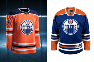
Edmonton made a major change. They "promoted" their orange 3rd jersey, with some changes, to be their new home look. They also changed the blue from royal to navy. The sleeve numbers on the old 3rd were on the top of the shoulders and now are on the sleeves, which I prefer. I like the new orange jersey which is intended to be a throwback to the Alberta Oilers days when this team was in the WHL.
Florida Panthers
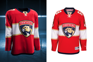
Seeing as this was a brand new look for the team last year, I didn't expect any changes. I still don't like it (maybe it would be a good 3rd jersey) but I want the leaping panther back.
Los Angeles Kings
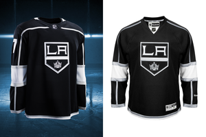
To me, prior to this look, the Kings have had a number of different looks and I liked them all. This look has always been my least favorite and it will probably be the one that sticks because they won a cup in it. That said, there wasn't much change. Just the collar (surprise!) with white on the back and black on the front. So they made their worst look even worse.
Minnesota Wild
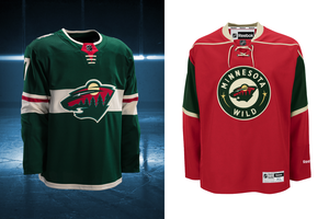
The Wild decided to create a whole new uniform for their home games. Going back to green was a good call! I actually really like what they did, the chest stripe is a cool look and it works well because the outline of the logo is the same colour. They added a little extra "flair" to the sleeve stripes by adding a red stripe into that. It's a big upgrade for me.
Montreal Canadians
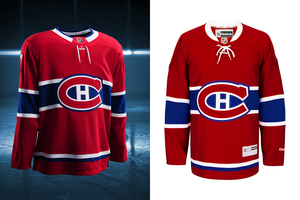
No change, classic Canadians look. As it should be.
Nashville Preditors
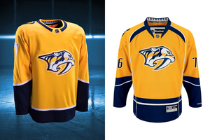
I've never really liked Nashville's yellow jerseys. They have a darker yellow 3rd with a different logo back when Peter Forsberg played there and I wasn't a huge fan of that look either. That said, this change is a step in the right direction in my books. The removal of the white piping and the weird blue on the top of the front of the jersey is a positive. I've heard people complain that the new look is "too plain" but I think plain is better that all the weird design elements that were on the previous version.
New Jersey Devils
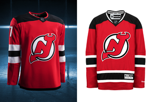
The Devils have basically had the same look since day 1. For a while they featured green in their look but even when they switched from green to black, the look was the same.
Until now.
The sleeve stripe colours were reversed. To me that looks bad but the killer is the hem stripe. It's just a thin black stripe. It looks so bad. Honestly, this looks like when you go to Wal-Mart and you see the jerseys for sale that aren't replicas. They are just kind of similar to the actually jersey but are only like $30 so people buy them because they don't want to spend the money on the actual thing.
Big big downgrade.
New York Islanders

They just can't make anything easy can they? They can't seem to find a home arena, they had some horrible uniforms and now that they are finally back on track (uniform-wise), they go and add that stupid collar. It's a really small change but it really hurts the look.
New York Rangers
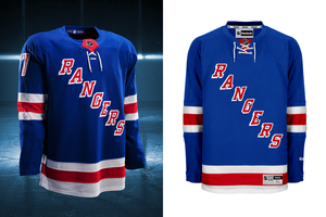
No change. There's a rumor that grey has been added to the white jersey, we will have to see, but if not then the Rangers have kept a classic look.
Ottawa Senators
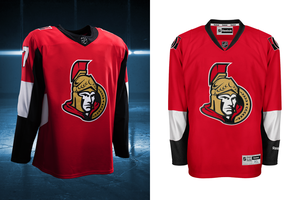
Not much of a change. More black on the sleeves. Too bad, this was one look I was really hoping would change.
Philadelphia Flyers

No change here either. I like this look. Glad to see that they didn't change.
Pittsburgh Penguins

This is my current favorite jersey. Although they went and screwed it up with the collar effect I still love this look. The skating penguin logo is so cool and the colour combo is the best!
San Jose Sharks
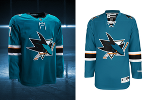
Guess who else did the collar effect that I dislike? Otherwise it's the same. It's really too bad though because this is a team that "got it on 1" and has screwed around with it's look but has never looked as good.
St. Louis Blues
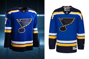
2 very, very small changes for the Blues. 1- the numbers are primarily white now. Historically they've been yellow. 2- the "hanger effect". they changed it from "est 1967" to a design that looks like the city's flag.
I'm not sure how I feel about the white numbers but overall it's still a really good looking jersey.
Tampa Bay Lightening
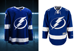
Collar effect here too (why couldn't the whole collar be white?). They also got rid of the tie-up which I actually like.
They still look too much like the Leafs to me, but at least they are staying consistent.
Toronto Maple Leafs
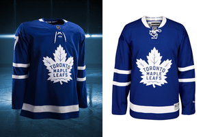
See: Tampa.
But seriously. the whole collar should be white. Toronto just introduced these last year so I expected no change. I still prefer the previous uniform to this one but I do prefer this logo.
Vancouver Canucks
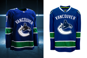
Again, the whole collar should be white. Otherwise no change to a uniform that I like. I think I'd like it better without the wordmark.
Washington Capitals
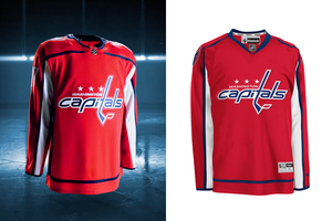
Very small change. The blue piping went to the top of the shoulders on the old one, now it goes across the top of the chest into the bottom part of the collar. Speaking of the collar, it's got red of the front, blue on the back. I don't like that (in case I haven't made that clear)! I was hoping the caps would make a significant change, guess not.
Winnipeg Jets
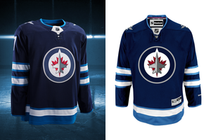
No change. That's cool. I still don't love these but they are sticking with it.
.....And team #31 unveiled their new look as well.
Vegas Golden Knights
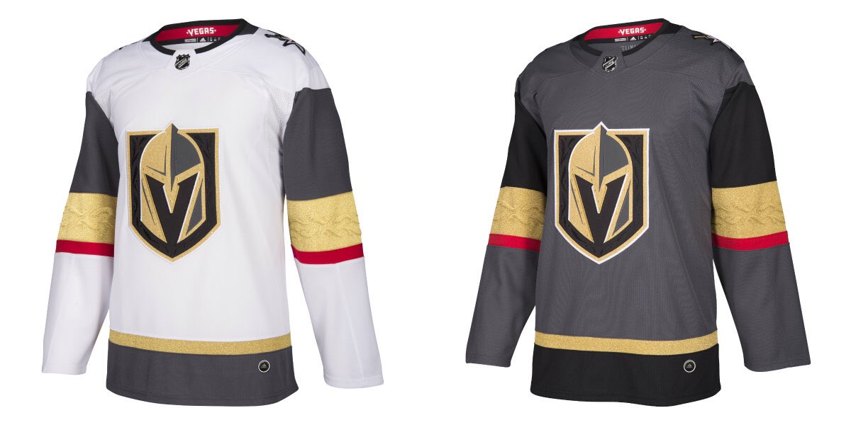
All in all, I actually really like the look. The pattern in the gold sleeve stripes is very noticeable when the light bounces off of it. They are pairing it with black pants and, a grey helmet and socks that match the sleeve striping.
I like the unique grey colour a lot, brings something new to the fold.
Last night the NHL expanded and the
But, being the jersey nerd that I am, the more exciting news to me was the release of the new home jerseys for the entire league. Adidas took over as the uniform supplier. Reebok is owned by Adidas so this is more of a branding shift really. Either way, we got new jerseys! Woo!
As of this morning, not all the away jerseys have been released and their will not be any 3rd jerseys. I thought I'd write a little post explaining how I feel about the new looks. Before I dive into that I just want to give credit where it is due. The images (which show the new jersey on the left, old on the right) are from Icethetics. It a great site for hockey uniform news, go check it out!
Anaheim Ducks
Not a lot of change here. You'll note that the collar is now orange on the back of the jersey and black on the front. A number of teams have opted to go this way and I really don't like that trend. It was something the NFL did and finally we are starting to see them move away from that. On the plus side the white drawstrings on the front look better than the black. Other than that, not much change. Until they bring back the Might Ducks logo, I won't be 100% satisfied with anything they do.
Arizona Coyotes
Not a lot of change here either. The new collar design is showing here as well with the black half being black. I really don't like that. Honestly, I don't care much for these uniforms but I really haven't cared much for anything this team has done since moving to Phoenix.
Boston Bruins
Boston kept it the same for the most part. They did change the font style slightly but it really was so small of a change that most people won't even notice it. A great look that stays!
Buffalo Sabres
This was one I was really looking forward to. The picture on the right (the old version) is missing the numbers on the front of the uniform. I was hoping that they would remove that, they did not. The collar effect is on the new uniform with yellow on the back, which I don't like. The silver piping on the front is now gone so that is a step up. The tie-up laces have been changed to the non-tie laces. All in all, it feels like 1 step forward, 1 step back with these new uniforms.
Calgary Flames
Another team that moved from tie-up to non-tie laces.
Not a heck of a lot of change with these either but the piping that ran up the jersey onto the sleeves are gone so, it's a step forward. Much like Buffalo there is a step back though, with the collar being black on the back, red on the front. Ant the flag patches are still there, I don't like those.
Carolina Hurricanes
A fun side fact, this team is entering their 20th season since moving from Hartford. That means the Hurricanes have been a thing longer than the Whalers ever were. That's so weird to me. Guess what they did? The collar effect I dislike. Black back, red front.That said; the Hurricanes added black back into their striping which was looks so much better. Although it is faint, the hurricane flag striping pattern is back the in red hem stripe. All in all they are back to looking like Carolina as opposed to team Canada.
Chicago Blackhawks
No changes. Still looking good! One side note, look at their collar, that's how it should be done!
Colorado Avalanche
My team! They brought back the look from those cup winning days. While i'm not thrilled by the collar (grey back, blue front) I'm so glad they brought back the hem striping to resemble a mountain is back so I'm super happy! I'll have to buy one of these.
Columbus Blue Jackets
I love this look and I'm glad that they kept it. If I was nit-picking, I would say that the collar should be white and red instead of blue and red but I can live with it as-is.
Dallas Stars
No Change. Again, a great looking uniform that I'm glad went untouched.
Detroit Red Wings
No change. Classic Red Wings.
Edmonton Oilers
Edmonton made a major change. They "promoted" their orange 3rd jersey, with some changes, to be their new home look. They also changed the blue from royal to navy. The sleeve numbers on the old 3rd were on the top of the shoulders and now are on the sleeves, which I prefer. I like the new orange jersey which is intended to be a throwback to the Alberta Oilers days when this team was in the WHL.
Florida Panthers
Seeing as this was a brand new look for the team last year, I didn't expect any changes. I still don't like it (maybe it would be a good 3rd jersey) but I want the leaping panther back.
Los Angeles Kings
To me, prior to this look, the Kings have had a number of different looks and I liked them all. This look has always been my least favorite and it will probably be the one that sticks because they won a cup in it. That said, there wasn't much change. Just the collar (surprise!) with white on the back and black on the front. So they made their worst look even worse.
Minnesota Wild
The Wild decided to create a whole new uniform for their home games. Going back to green was a good call! I actually really like what they did, the chest stripe is a cool look and it works well because the outline of the logo is the same colour. They added a little extra "flair" to the sleeve stripes by adding a red stripe into that. It's a big upgrade for me.
Montreal Canadians
No change, classic Canadians look. As it should be.
Nashville Preditors
I've never really liked Nashville's yellow jerseys. They have a darker yellow 3rd with a different logo back when Peter Forsberg played there and I wasn't a huge fan of that look either. That said, this change is a step in the right direction in my books. The removal of the white piping and the weird blue on the top of the front of the jersey is a positive. I've heard people complain that the new look is "too plain" but I think plain is better that all the weird design elements that were on the previous version.
New Jersey Devils
The Devils have basically had the same look since day 1. For a while they featured green in their look but even when they switched from green to black, the look was the same.
Until now.
The sleeve stripe colours were reversed. To me that looks bad but the killer is the hem stripe. It's just a thin black stripe. It looks so bad. Honestly, this looks like when you go to Wal-Mart and you see the jerseys for sale that aren't replicas. They are just kind of similar to the actually jersey but are only like $30 so people buy them because they don't want to spend the money on the actual thing.
Big big downgrade.
New York Islanders
They just can't make anything easy can they? They can't seem to find a home arena, they had some horrible uniforms and now that they are finally back on track (uniform-wise), they go and add that stupid collar. It's a really small change but it really hurts the look.
New York Rangers
No change. There's a rumor that grey has been added to the white jersey, we will have to see, but if not then the Rangers have kept a classic look.
Ottawa Senators
Not much of a change. More black on the sleeves. Too bad, this was one look I was really hoping would change.
Philadelphia Flyers
No change here either. I like this look. Glad to see that they didn't change.
Pittsburgh Penguins
This is my current favorite jersey. Although they went and screwed it up with the collar effect I still love this look. The skating penguin logo is so cool and the colour combo is the best!
San Jose Sharks
Guess who else did the collar effect that I dislike? Otherwise it's the same. It's really too bad though because this is a team that "got it on 1" and has screwed around with it's look but has never looked as good.
St. Louis Blues
2 very, very small changes for the Blues. 1- the numbers are primarily white now. Historically they've been yellow. 2- the "hanger effect". they changed it from "est 1967" to a design that looks like the city's flag.
I'm not sure how I feel about the white numbers but overall it's still a really good looking jersey.
Tampa Bay Lightening
Collar effect here too (why couldn't the whole collar be white?). They also got rid of the tie-up which I actually like.
They still look too much like the Leafs to me, but at least they are staying consistent.
Toronto Maple Leafs
See: Tampa.
But seriously. the whole collar should be white. Toronto just introduced these last year so I expected no change. I still prefer the previous uniform to this one but I do prefer this logo.
Vancouver Canucks
Again, the whole collar should be white. Otherwise no change to a uniform that I like. I think I'd like it better without the wordmark.
Washington Capitals
Very small change. The blue piping went to the top of the shoulders on the old one, now it goes across the top of the chest into the bottom part of the collar. Speaking of the collar, it's got red of the front, blue on the back. I don't like that (in case I haven't made that clear)! I was hoping the caps would make a significant change, guess not.
Winnipeg Jets
No change. That's cool. I still don't love these but they are sticking with it.
.....And team #31 unveiled their new look as well.
Vegas Golden Knights
All in all, I actually really like the look. The pattern in the gold sleeve stripes is very noticeable when the light bounces off of it. They are pairing it with black pants and, a grey helmet and socks that match the sleeve striping.
I like the unique grey colour a lot, brings something new to the fold.
Subscribe to:
Posts (Atom)