When I found Chris Creamer's Sportslogos.net website about 10 years ago, my interest was heightened to a new level.
I have spent a fair amount of time speaking about the Toronto Argos uniform changes this year over on the boards at Sportslogos.net. Which has lead to me this post: My personal favorite look for each of the CFL teams.
Originally, I was going to go through all the teams but some haven't really had more than 1 look like the American expansion teams or, in the case of the Ottawa Renegades, only 2 looks.
So, I will be posting my favorite looks for the current CFL teams. I realize that doesn't leave much to chose from for the Ottawa REDBLACKS as they are only in their 4th season.
Let's start in the West division (alphabetically).
BC Lions:
I have always been a fan of the paw print logo of the 60's. From 1963 to 1966 the Lions wore the below uniforms and I loved them. From the simple number font to the orange not being over-used or too bright (as I feel the orange has become over the years). In my mind, this uniform is the best they ever had.

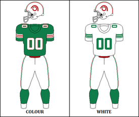
Calgary Stampeders:
Sometimes keeping it simple is the way to go. In the 80s and 90s the Stamps did that. Red helmet, simple jersey with the logo on the sleeve, socks match jersey, opposite colour for the pants. Minimal inclusion of black made this team have a unique look.

Edmonton Eskimos:
In the early 2000s The Eskimos were a great looking team! A lot of people have compared this uniform to the Green Bay Packers. There are key differences (like the Packers don't wear white pants) but I get it. That doesn't mean Edmonton's uniforms were bad. After this set, the Eskimos tried a few very different looks with piping and added a green helmet. None are as nice as this.

Saskatchewan Roughriders:
I had a little harder time with getting a complete uniform history of the 'Riders but the set that the riders wore up until 2002 (I believe it was introduced in the 80s.) was hands-down the best.
Although I could take or leave the black 3rd jersey, the home and away I still love! The helmet with the logo stripes that connected in the back and the grey pants. To me, this should always be the 'Riders look.

Winnipeg Blue Bombers:
From the 70s right through to 1995 the Bombers wore a set unique to all of football. The gold helmets and pants were great and having a blue uniform (I mean, they are the BLUE Bombers) just makes sense. I also really liked that the sleeve stripes matched the sock stripes.

Off to the East now!
Hamilton Tiger-Cats:
In 1967 the Ti-Cats adopted the below uniforms that were the look until 1986, when the switched to a black helmet. The yellow helmet was a unique look and the sleeves being different colours was also unique. It's these little things that make this uniform set so unique and I really wish they would just bring it back.

Montreal Alouettes:
The Alouettes have a weird history, from the 1946 to 1981 they were the Alouettes. From 1982 to 1985 the team was re-names the Concordes just to be re-named the Alouettes in 1986 & 1987 before the team folded. Then, in 1994 & 1995 Baltimore received a CFL expansion team but after the NFL came back to Baltimore (funny enough, it was the Browns who have a similar historical "blip") The Stallions were moved to Montreal as the Alouettes to "resume" the history that ended in 1987. So basically, according to history, the Alouettes took a break from 1988 to 1996. Unlike I did with Ottawa, which has had 3 uniquely different teams, I opted to follow this weird historical allowance.
With that said, the 1970-1973 uniforms were my favorites. The logo was simple but still conveyed a bird and, the red and green colour scheme (even though it may remind you of Christmas) was different and the sleeve stripes are a classic.
Ottawa REDBLACKS:
The REDBLACKS (yes, capitalizing the whole name is correct) have only had 2 uniform sets thus far as I mentioned earlier. I don't particularly love either to be honest but I prefer the first set. The all black look is generally something I do not love but, due to the team name, it makes sense (with the red numbers). I really liked the idea of the 3rd but it never panned out. Drop the logo on the front for numbers and it looks much better. I still hope to see a uniform that has a lot of the plaid look one day.

Toronto Argos:
So many looks to choose from but from 1981 to 1988 the Argos wore what I prefer. I love that football as a boat logo (and this was the last time it was used as a primary logo) and I like the kind of "chunky" sleeve stripes. Simple but a little different.

So I guess you could say, if I was in charge, this is what the CFL uniforms would look like in 2017.
If you prefer a different look, let me know in the comments! I always like to hear other people's preferences and why.
This post sucks.
ReplyDelete